San Francisco housing complex brings nature together with people
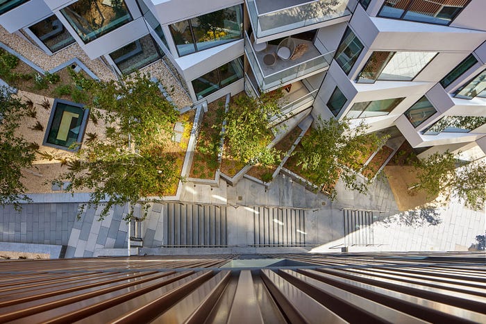
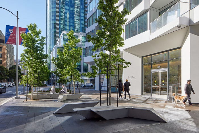
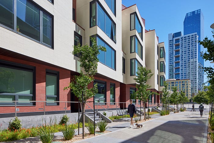
Designed by Studio Gang, with landscape architecture by Interstice Architects, MIRA is a vertical neighborhood. The San Francisco housing complex has more than 130 native plants spread through the 54,000 square feet of open space, all around the 392-unit luxury condo community. There are spaces for people, wildlife and pedestrians. Here, everything lives together in harmony.

MIRA neighborhood will be spread across five levels and create a beautiful green space right in the heart of downtown San Francisco. There will be food and nesting areas, for local insect and bird populations, and places for pedestrians to walk and enjoy the wildlife.
Related: Morgenfarm proposes vertical farms to replace Berlin’s Autobahn

The condo tower itself has a twisting shape and rotating bay windows. The design actually has a practical purpose. In addition to looking amazing, it prevents bird strikes. Around one billion birds visit San Francisco via the Pacific Coast Flyway. This space will serve as an ecological corridor that provides food and nesting for the birds. The unique shape also breaks up the wind and creates a self-shading design on some floors.

There are 5,000 square feet of green roofs full of perennials, shrubs, small trees and grasses. The natural green roofs help cool the building. Massive cedar logs have been placed to divide different plants and encourage long-term growth. The logs will decompose and decay over time. There’s also an outdoor fireplace, outdoor kitchen, dining areas and incredible views. A gray water recycling system irrigates all the plants.

From inside the units, residents will have views of the San Francisco Bay, the famed Bay Bridge and the city skyline. The building has one, two and three bedroom condos and townhouses. The building itself has a conference room, a children’s playroom, a fitness center, a dog-washing station, valet parking and retail space at the street level.
MIRA is a place where humans, birds and insects all live together in harmony. And isn’t that the design that we should all be following?
Photography by Bruce Damonte
Written by KC Morgan
